(Quick Reference)
script
Purpose
The script component is used to specify the script codes running at the browser. Notice that, unlike zscript, the script codes are running at the browser. They are usually written in JavaScript which is supported by the most of browsers. The simplest format is as follows.
Examples
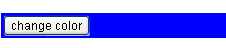
<z:window id="win">
    <z:button label="change color" onClick="Clients.evalJavaScript('myfunc()');"/>
</z:window>
<z:script type="text/javascript">
    function myfunc() {
        jq("$win").css("backgroundColor", "blue");
    }
</z:script>
Description
Attributes
src (optional) - Sets the URI of the source that contains the script codes. You either add the script codes directly with the Label children, or set the URI to load the script codes with setSrc(java.lang.String). But, not both. see morecontent (optional) - Sets the content of the script element. By content we mean the JavaScript codes that will be enclosed by the HTML SCRIPT element. see morechar (optional) - Sets the character encoding of the source. It is used with setSrc(java.lang.String). Refer to HTML Character Setsfor more information. see moredefer (optional) - Sets whether to defer the execution of the script codes. see morepackages (optional) - Sets the list of packages to load before evaluating the script defined in getContent(). If more than a package to load, separate them with comma. see moretype (optional) - Deprecated. As of release 5.0.0, it is meaningless since text/javascript is always assumed. see moreid (optional) - Description copied from interface: Component Sets the ID. The scope of uniqueness depends on whether this component is a root component. Refer to Component.getId() for more details. Default: "" (an empty string; it means no ID at all). see moremold (optional) - Description copied from interface: Component Sets the mold to render this component. see morewidgetClass (optional) - Description copied from interface: Component Sets the widget class (aka., the widget type). The widget class is a JavaScript class, including the package name. For example, "zul.wnd.Window". see morestubonly (optional) - Description copied from interface: Component Sets whether this component is stub-only. By stub-only, we mean we don't need to maintain the states of the component at the server side. Default: "inherit" (i.e., the same as the parent's stub-only, and "false" is assumed if none of parents is specified with stub-only). If a component is set to stub-only, the application running at the server shall not access it anymore after renderred to the client. The ZK loader will try to minimize the memory footprint by merging stub-only components and replacing with light-weight components. However, the event listeners and handlers are preserved, so they will be invoked if the corresponding event is received. Since the original component is gone, the event is the more generic format: an instance of Event (rather than MouseEvent or others). If a component is stub-only, the application usually access it only at the client since all widgets are preserved at the client (so are events). This method is available only for ZK EE. see moredefinition (optional) - Description copied from interface: ComponentCtrl Sets the component definition by specifing the name. see morevisible (optional) - Description copied from interface: Component Sets whether this component is visible. see more
ZK Official Reference
Component Reference
Show script Component ReferenceJava API
Show script Java API