(Quick Reference)
panelPurposePanel is a container that has specific functionality and structural components that make it the perfect building block for application-oriented user interfaces. The Panel contains bottom, top, and foot toolbars, along with separate header, footer and body sections. It also provides built-in collapsible, closable, maximizable, and minimizable behavior, along with a variety of pre-built tool buttons that can be wired up to provide other customized behavior. Panels can be easily embedded into any kind of ZUL component that is allowed to have children or layout component. Panels also provide specific features like float and move. Unlike Window, Panels can only be floated and moved inside its parent node, which is not using zk.setVParent() function at client side. In other words, if Panel's parent node is an relative position, the floated panel is only inside its parent, not the whole page. The second difference of Window is that Panel is not an independent ID space (by implementing IdSpace), so the ID of each child can be used throughout the panel. Examples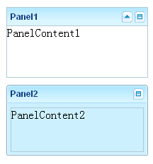 <z:panel height="100px" width="200px" style="margin-bottom:10px" title="Panel1"
border="normal" maximizable="true" collapsible="true">
<z:panelchildren>PanelContent1</z:panelchildren>
</z:panel>
<z:panel height="100px" width="200px" framable="true" title="Panel2" border="normal"
maximizable="true" style="margin-bottom:10px">
<z:panelchildren>PanelContent2</z:panelchildren>
</z:panel>DescriptionAttributes
open (optional) - Opens or closes this Panel. see moreframable (optional) - Deprecated. As of release 5.0.6, replaced with setBorder(java.lang.String). Sets whether to render the panel with custom rounded borders. Default: false. see moremovable (optional) - Sets whether to move the panel to display it inline where it is rendered. Default: false; Note that this method only applied when isFloatable() is true. see moremaximized (optional) - Sets whether the panel is maximized, and then the size of the panel will depend on it to show a appropriate size. In other words, if true, the size of the panel will count on the size of its offset parent node whose position is absolute (by isFloatable()) or its parent node. Otherwise, its size will be original size. Note that the maximized effect will run at client's sizing phase not initial phase. Default: false. see moreminimized (optional) - Sets whether the panel is minimized. Default: false. see moreminimizable (optional) - Sets whether to display the minimizing button and allow the user to minimize the panel. Note that this button provides no implementation the behavior of minimizing a panel is implementation-specific, so the MinimizeEvent event must be handled and a custom minimize behavior implemented for this option to be useful. Default: false. Note: the maximize button won't be displayed if no title or caption at all. see morecollapsible (optional) - Sets whether to show a toggle button on the title bar. Default: false. Note: the toggle button won't be displayed if no title or caption at all. Note: onOpen event will be sent when you click the toggle button see moreminheight (optional) - Sets the minimum height in pixels allowed for this panel. If negative, 100 is assumed. Default: 100. Note: Only applies when isSizable() = true. see moreminwidth (optional) - Sets the minimum width in pixels allowed for this panel. If negative, 200 is assumed. Default: 200. Note: Only applies when isSizable() = true. see moresizable (optional) - Sets whether the panel is sizable. If true, an user can drag the border to change the panel width. Default: false. see moretitle (optional) - Sets the title. see morevisible (optional) - Description copied from interface: Component Sets whether this component is visible. see moreborder (optional) - Sets the border. Allowed values include none (default), normal, rounded and rounded+. For more information, please refer to ZK Component Reference: Panel. see moreclosable (optional) - Sets whether to show a close button on the title bar. If closable, a button is displayed and the onClose event is sent if an user clicks the button. Default: false. You can intercept the default behavior by either overriding onClose(), or listening the onClose event. Note: the close button won't be displayed if no title or caption at all. see moremaximizable (optional) - Sets whether to display the maximizing button and allow the user to maximize the panel, when a panel is maximized, the button will automatically change to a restore button with the appropriate behavior already built-in that will restore the panel to its previous size. Default: false. Note: the maximize button won't be displayed if no title or caption at all. see morefloatable (optional) - Sets whether to float the panel to display it inline where it is rendered. Note that by default, setting floatable to true will cause the panel to display at default offsets, which depend on the offsets of the embedded panel from its element to document.body because the panel is absolute positioned, the position must be set explicitly by HtmlBasedComponent.setTop(String) and HtmlBasedComponent.setLeft(String). Also, when floatable a panel you should always assign a fixed width, otherwise it will be auto width and will expand to fill to the right edge of the viewport. see morecontext (optional) - Sets the ID of the popup ( Popup) that should appear when the user right-clicks on the element (aka., context menu). An onOpen event is sent to the context menu if it is going to appear. Therefore, developers can manipulate it dynamically (perhaps based on OpenEvent.getReference) by listening to the onOpen event. Note: To simplify the use, it not only searches its ID space, but also all ID spaces in the desktop. It first searches its own ID space, and then the other Id spaces in the same browser window (might have one or multiple desktops). (since 3.0.2) If there are two components with the same ID (of course, in different ID spaces), you can specify the UUID with the following format: uuid(comp_uuid) see morepopup (optional) - Sets the ID of the popup ( Popup) that should appear when the user clicks on the element. An onOpen event is sent to the popup menu if it is going to appear. Therefore, developers can manipulate it dynamically (perhaps based on OpenEvent.getReference) by listening to the onOpen event. Note: To simplify the use, it not only searches its ID space, but also all ID spaces in the desktop. It first searches its own ID space, and then the other Id spaces in the same browser window (might have one or multiple desktops). (since 3.0.2) If there are two components with the same ID (of course, in different ID spaces), you can specify the UUID with the following format: uuid(comp_uuid) (since 3.6.3) the popup can be shown by a position from Popup.open(org.zkoss.zk.ui.Component, String) or the location of x and y, you can specify the following format: id, position id, position=before_start id, x=15, y=20 uuid(comp_uuid), position uuid(comp_uuid), x=15, y=20 see morectrlKeys (optional) - Sets what keystrokes to intercept. The string could be a combination of the following: see moretooltip (optional) - Sets the ID of the popup ( Popup) that should be used as a tooltip window when the mouse hovers over the element for a moment. An onOpen event is sent to the tooltip if it is going to appear. Therefore, developers can manipulate it dynamically (perhaps based on OpenEvent.getReference) by listening to the onOpen event. Note: To simplify the use, it not only searches its ID space, but also all ID spaces in the desktop. It first searches its own ID space, and then the other Id spaces in the same browser window (might have one or multiple desktops). (since 3.0.2) If there are two components with the same ID (of course, in different ID spaces), you can specify the UUID with the following format: uuid(comp_uuid) (since 3.6.3) the tooltip can be shown by a position from Popup.open(org.zkoss.zk.ui.Component, String) or the location of x and y, and can be specified with a delay time (in millisecond), you can specify the following format: id, position id, position=before_start, delay=500 id, x=15, y=20 uuid(comp_uuid2), position uuid(comp_uuid), x=15, y=20 see moreclass (optional) - Sets the CSS class. This method is a bit confused with Java's class, but we provide it for XUL compatibility. The same as setSclass(java.lang.String). see moreleft (optional) - Sets the left position. If you want to specify right, use setStyle(java.lang.String) instead. For example, setStyle("right: 0px"); see moretop (optional) - Sets the top position. If you want to specify bottom, use setStyle(java.lang.String) instead. For example, setStyle("bottom: 0px"); see morezIndex (optional) - Sets the Z index. see morezindex (optional) - Sets the Z index. see moreheight (optional) - Sets the height. If null, the best fit is used. see moretooltiptext (optional) - Sets the text as the tooltip. see morezclass (optional) - Sets the ZK Cascading Style class(es) for this component. It usually depends on the implementation of the mold (@{link #getMold}). see moresclass (optional) - Sets the CSS class. see moredraggable (optional) - Sets "true" or "false" to denote whether a component is draggable, or an identifier of a draggable type of objects. The simplest way to make a component draggable is to set this attribute to true. To disable it, set this to false. If there are several types of draggable objects, you could assign an identifier for each type of draggable object. The identifier could be anything but empty. see moredroppable (optional) - Sets "true" or "false" to denote whether a component is droppable, or a list of identifiers of draggable types of objects that could be droped to this component. The simplest way to make a component droppable is to set this attribute to true. To disable it, set this to false. If there are several types of draggable objects and this component accepts only some of them, you could assign a list of identifiers that this component accepts, separated by comma. For example, if this component accepts dg1 and dg2, then assign "dg1, dg2" to this attribute. see morefocus (optional) - Sets focus to this element. It is same as focus(), but used to allow ZUML to set focus to particular component. <textbox focus="true"/> see morerenderdefer (optional) - Sets the number of milliseconds before rendering this component at the client. Default: -1 (don't wait). This method is useful if you have a sophiscated page that takes long to render at a slow client. You can specify a non-negative value as the render-defer delay such that the other part of the UI can appear earlier. The styling of the render-deferred widget is controlled by a CSS class called z-renderdefer. Notice that it has no effect if the component has been rendered at the client. see morevflex (optional) - Sets vertical flexibility hint of this component. Number flex indicates how this component's container distributes remaining empty space among its children vertically. Flexible component grow and shrink to fit their given space. Flexible components with larger flex values will be made larger than components with lower flex values, at the ratio determined by all flexible components. The actual flex value is not relevant unless there are other flexible components within the same container. Once the default sizes of components in a container are calculated, the remaining space in the container is divided among the flexible components, according to their flex ratios. Specify a flex value of negative value, 0, or "false" has the same effect as leaving the flex attribute out entirely. Specify a flex value of "true" has the same effect as a flex value of 1. Special flex hint, "min", indicates that the minimum space shall be given to this flexible component to enclose all of its children components. That is, the flexible component grow and shrink to fit its children components. see morehflex (optional) - Sets horizontal flex hint of this component. Number flex indicates how this component's container distributes remaining empty space among its children horizontally. Flexible component grow and shrink to fit their given space. Flexible components with larger flex values will be made larger than components with lower flex values, at the ratio determined by all flexible components. The actual flex value is not relevant unless there are other flexible components within the same container. Once the default sizes of components in a container are calculated, the remaining space in the container is divided among the flexible components, according to their flex ratios. Specify a flex value of negative value, 0, or "false" has the same effect as leaving the flex attribute out entirely. Specify a flex value of "true" has the same effect as a flex value of 1. Special flex hint, "min", indicates that the minimum space shall be given to this flexible component to enclose all of its children components. That is, the flexible component grow and shrink to fit its children components. see morewidth (optional) - Sets the width. If null, the best fit is used. see morestyle (optional) - Sets the CSS style. see moreaction (optional) - Sets the client-side action (CSA). Default: null (no CSA at all) The format: action1: action-effect1; action2: action-effect2 Currently, only two actions are show and hide. They are called when the widget is becoming visible (show) and invisible (hide). The action effect (action-effect1) is the name of a method defined in zk.Actions, such as show: slideDown; hide: slideUp You could specify the effects as follows: show: slideDown({duration:1000}) Security Tips: the action is not encoded and it is OK to embed JavaScript, so, if you want to allow users to specify the action, you have to encode it. Note for developers upgraded from ZK 3: CSA's format is different and limited. In additions, it is part of HtmlBasedComponent. see moreid (optional) - Description copied from interface: Component Sets the ID. The scope of uniqueness depends on whether this component is a root component. Refer to Component.getId() for more details. Default: "" (an empty string; it means no ID at all). see moremold (optional) - Description copied from interface: Component Sets the mold to render this component. see morewidgetClass (optional) - Description copied from interface: Component Sets the widget class (aka., the widget type). The widget class is a JavaScript class, including the package name. For example, "zul.wnd.Window". see morestubonly (optional) - Description copied from interface: Component Sets whether this component is stub-only. By stub-only, we mean we don't need to maintain the states of the component at the server side. Default: "inherit" (i.e., the same as the parent's stub-only, and "false" is assumed if none of parents is specified with stub-only). If a component is set to stub-only, the application running at the server shall not access it anymore after renderred to the client. The ZK loader will try to minimize the memory footprint by merging stub-only components and replacing with light-weight components. However, the event listeners and handlers are preserved, so they will be invoked if the corresponding event is received. Since the original component is gone, the event is the more generic format: an instance of Event (rather than MouseEvent or others). If a component is stub-only, the application usually access it only at the client since all widgets are preserved at the client (so are events). This method is available only for ZK EE. see moredefinition (optional) - Description copied from interface: ComponentCtrl Sets the component definition by specifing the name. see more ZK Official ReferenceComponent ReferenceShow panel Component ReferenceJava APIShow panel Java API
|
|