Grails ZK UI Plugin - Reference Documentation
Authors: groovyquan
Version: 0.5.1
Table of Contents
1 Introduction
ZK UI plugin,the same as the ZKGrails plugin, seamlessly integrates ZK with Grails' infrastructures.The difference is it uses the Grails' infrastructures more, such as gsp, controllers rather than zk's zul.ZK UI Grails plug-ins brings powerful features as follows1.1 Taglib
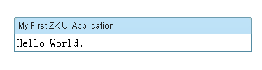
Use Tag Libraries<z:window title="My First ZK UI Application" border="normal"> Hello World! </z:window>
1.2 Composer
Provides a Composer Artefacts simplify the integration between grails and zkUsage:grails create-composer [name]
1.3 Builder
A groovy way to create zk components, following groovy Builder paradigmController
def index = {
    def window = new Window(title: "listbox demo", border: "normal")
    window << {
        listbox {
            listhead(sizable: true) {
                listheader(label: "name", sort: "auto")
                listheader(label: "gender", sort: "auto")
            }
            listitem {
                listcell(label: "Mary")
                listcell(label: "FEMALE")
            }
            listitem {
                listcell(label: "John")
                listcell(label: "MALE")
            }
            listitem {
                listcell(label: "Jane")
                listcell(label: "FEMALE")
            }
            listitem {
                listcell(label: "Henry")
                listcell(label: "MALE")
            }
            listfoot {
                listfooter {
                    label(value: "This is footer1")
                }
                listfooter {
                    label(value: "This is footer2")
                }
            }
        }
    }
    [window:window]
}
View
<z:render comp="${window}"/>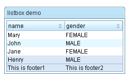
1.4 Selector
Provides a very convenient API for extracting and manipulating zk component, using the jquery-like methods.View<z:window id="window"> <z:textbox name="t1" value="value1"/> <z:textbox id="t2" value="value2"/> <z:textbox value="value3"/> </z:window>
assert 3 == window.select("textbox").size()
assert "value2" == window.select("#t2")[0].value
assert "value1" == window.select("textbox[name='t1']")[0].value
2 Getting Started
2.1 Hello World
DOCTYPE
The html pages generated by gsp must generate the doc type as follows.<!DOCTYPE html PUBLIC "-//W3C//DTD XHTML 1.0 Transitional//EN" "http://www.w3.org/TR/xhtml1/DTD/xhtml1-transitional.dtd">
Importing resources
Add the tag <z:resources/> to the head of the layout/main.gsp or any page that you want to use ZK UI Grails plug-ins.<html xmlns="http://www.w3.org/1999/xhtml"> <head> <z:resources/>
Hello World!
<!DOCTYPE html PUBLIC "-//W3C//DTD XHTML 1.0 Transitional//EN" "http://www.w3.org/TR/xhtml1/DTD/xhtml1-transitional.dtd"> <html xmlns="http://www.w3.org/1999/xhtml"> <head> <title>Hello World Demo</title> <z:resources/> </head><body> <z:window title="My First ZK UI Application" border="normal"> Hello World! </z:window> </body> </html>
2.2 Say Hello in Ajax way
Let us put some interactivity into it.<z:button label="Say Hello" onClick="Messagebox.show('Hello World! Time now is:'+new Date())"/>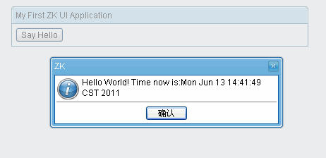 The onClick attribute is a special attribute used to add an event listener to the component such that it is invoked when an end user clicks the component. The attribute value could be any legal groovy code.Here we invoke Messagebox.show(String) to show a message box as depicted above.
Notice that it is not JavaScript,It is Groovy and runs at the server
2.3 Identify a component
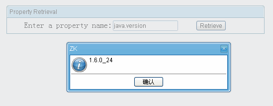
A component is a POJO, so you can reference it any way you like. However, ZK provides a convenient way to identify and to retrieve a component: identifier. For example, we named the textbox as input by assigning id to it, as follows.<z:window title="Property Retrieval" border="normal"> Enter a property name: <z:textbox id="input"/> <z:button label="Retrieve" onClick="Messagebox.show(System.getProperty(input.getValue()))"/> </z:window>
2.4 A component is a POJO
A component is a POJO. You could instantiate and manipulate directly. For example, we could generate the result by instantiating a component to represent it, and then append it to another component (an instance of vlayout).<z:window title="Property Retrieval" border="normal"> Enter a property name: <z:textbox id="input"/> <z:button label="Retrieve" onClick="result.appendChild(new Label(System.getProperty(input.getValue())))"/> <z:vlayout id="result"/> </z:window>
<z:window title="Property Retrieval" border="normal">
    Enter a property name: <z:textbox id="input"/>
    <z:button label="Retrieve" onClick="result.setValue(System.getProperty(input.getValue()))"/>
    <z:separator/>
    <z:label id="result"/>
</z:window>
2.5 Separating code from user interface
Embedding Groovy code in a gsp page is straightforward and easy to read. However, in a production environment, it is usually better to separate the code from the user interfaces. In additions, the compiled Groovy code runs much faster than the embedded code which is interpreted at the run time.To separate code from UI, we could implement a Composeruse create-composer commandgrails create-composer zkuidemo.PropertyRetriever
package zkuidemoimport org.zkoss.zk.ui.Component
import org.zkoss.zk.ui.event.Event
import org.zkoss.zul.Labelclass PropertyRetrieverComposer {    def afterCompose = {Component target ->
        target.addEventListener("onClick", new org.zkoss.zk.ui.event.EventListener() { //add a event listener in Groovy
            public void onEvent(Event event) {
                String prop = System.getProperty(target.getFellow("input").getValue())
                target.getFellow("result").appendChild(new Label(prop))
            }
        });
    }
}
package zkuidemoimport org.zkoss.zk.ui.Component
import org.zkoss.zk.ui.event.Event
import org.zkoss.zul.Labelclass PropertyRetrieverComposer {    def afterCompose = {Component target ->
        target.addEventListener("onClick") {Event event ->
            String prop = System.getProperty(target.getFellow("input").value)
            target.getFellow("result").appendChild(new Label(prop))
        }
    }
}
<z:window title="Property Retrieval" border="normal">
    Enter a property name: <z:textbox id="input"/>
    <z:button label="Retrieve" apply="zkuidemo.PropertyRetrieverComposer"/>
    <z:separator/>
    <z:vlayout id="result"/>
</z:window>
3 Composer
A composer is responsible to initialize a component (or a component of tree) when ZK loader is composing a component. It is the controller in the MVC pattern, while the component is the view,which separate the code from the user interfaces.3.1 Creating a composer
Composers can be created with the create-composer target. For example try running the following command from the root of a Grails project:grails create-composer window
class WindowComposer {
    def afterCompose = {Component comp ->
        // initialize components here
    }
}afterCompose closure to initialize components.The create-composer command is merely for convenience and you can just as easily create composers using your favorite text editor or IDE
3.2 Apply a composer
Each component Taglib has aapply attribute,so you can place the composer here
<z:window id="myWindowComposer" apply="package.WindowComposer">
    …
</z:window>
def afterCompose = {Component comp ->
    assert comp.id=="myWindowComposer"
    assert (comp instanceof org.zkoss.zul.Window)
}
3.3 Auto-wired Component
If apply acomposer to a Component that implement a IdSpace Interface,such as org.zkoss.zul.Window. The Component's children can be auto-wired to composer's fieldsThe following is an example. The onChange event received by Textbox mytextbox will be forwarded to target Window mywin as a new target event onChange_mytextbox and the Textbox component with id name "mytextbox" and Label with id name mylabel are injected into the "mytextbox" and "mylabel" fields respectively(so you can use mytextbox and mylabel variable directly in onChange_mytextbox without problem).Composer
class MyComposer{
    Textbox mytextbox
    Window self //embeded object, the supervised window "mywin"
    Page page //the ZK page
    Label mylabel    def afterCompose = {Component comp ->
        assert mytextbox.id=="mytextbox"
        assert mylabel.id=="mylabel"
    }    def onChange_mytextbox(Event event) {
        mylabel.setValue("You just entered: "+ mytextbox.getValue())
    }
}<z:window id="mywin" apply="MyComposer"> <z:textbox id="mytextbox"/> <z:label id="mylabel"/> </z:window>
3.4 Redirects
Actions can be redirected using the redirect method present in all composersThe parameters ofredirect is same as controller's redirectComposer
class MyComposer{
    Button mybutton    def afterCompose = {Component comp ->    }    def onClick_mybutton(Event event) {
        redirect(controller: 'demo', action: 'index', id: 1)
    }
}
following code same asViewonClick_buttonabovedef afterCompose = {Component comp -> mybutton.addEventListener('onClick'){ redirect(controller: 'demo', action: 'index', id: 1) } }
<z:window id="mywin" apply="MyComposer">
    <z:button label="mybutton"/>
</z:window>
3.5 Data Binding
To uses Grails' underlying data binding capability,zkui injection a getParams method to Component.Domain Class
class Person {
    String firstName
    String lastName
    String fullName
    static constraints = {
    }
}<z:window id="mywin" apply="MyComposer"> <z:textbox name="firstName"/> <z:textbox name="lastName"/> <z:textbox name="fullName"/> <z:button label="submit"/> </z:window>
class MyComposer{
    Button submit
    def afterCompose = {Component mywin ->
        submit.addEventListener('onClick'){
            def person=new Person(mywin.params)
            …
        }
    }
}bindData method same as in controller also provide to Composerdef p = new Person()
bindData(p, mywin.params)3.6 Unit Test
When use grails create-composer create a composer,a unit class that is a sub-class of ComposerUnitTestCase also createdIt provides amockComposer methods for mocking zkui's Selector,Builder and so on.mockComposer(MyComposer)
def myComposer=new MyComposer
...3.7 Render Errors
zkui injection a renderErrors method to Component.If you have Domain class
class Book{
    String author
    String title
}<z:window id="formWindow" title="demo" apply="your.Composer"> <z:textbox name="author"/> <z:textbox name="title"/> … </z:window>
your.Composer use renderErrorsif (!book.save()) {
formWindow.renderErrors(bean: book)
}renderErrorsIn your.Composer
if (!book.save()) {
    flash.book = book
    redirect(controller: "book", action: "edit", id: book.id)
 }
<g:hasErrors bean="${flash.book}">
<div class="errors">
    <g:renderErrors bean="${flash.book}" as="list" />
</div>
</g:hasErrors>
3.8 ZK's old Data Binding
Data binding is a mechanism that automates the data-copy plumbing code (CRUD) between UI components and the data source. Application developers only have to tell the data binding manager about the associations between UI components and the data source. Then, the data -binding manager will do all the loading (loading data from the data source to UI components) and saving (saving data from UI component into the data source) jobs automatically.Activates Data Binding Manager
<z:window  apply="org.zkoss.demo.MyComposer,org.zkoss.zkplus.databind.AnnotateDataBindingComposer">
</z:window>
Associate UI Components with Data Source
After activating the data-binding manager, you have to define the required UI objects and then associate them with the data source.In the gsp view:<z:window id="win" apply="test.TestComposer,org.zkoss.zkplus.databind.AnnotateDataBindingComposer"> <z:textbox value="@{win#composer.username}"/> <z:/window>
class TestComposer{    def username="test"    def afterCompose = {Component comp ->
        …
    }
}3.9 The Next Generation Data Binding System
Introduction
ZK Bind is a whole new data binding system with new specifications and implementations.For detailsEnvisage ZK 6: The Next Generation Data Binding System3.10 An Annotation Based Composer For MVC
The Story
Think of an extremely ordinary scenario, where you want to clear all the texts in a form by clicking a button.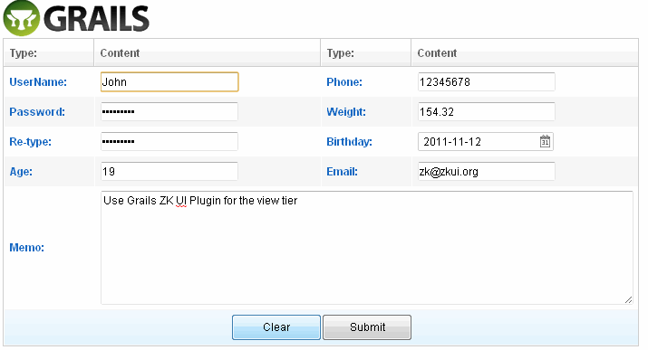 While you see the screen shot, you may have already come up with an implementation in mind. For example:
class SomeFormComposer {    Textbox usenameTb
    Textbox passwordTb
    Textbox retypepwTb
    // …
    // …
    Textbox memoTb    def afterCompose = {Component comp ->
        // initialize components here
    }    def onClick_clearBtn(Event event) {
        usenameTb.setValue("")
        passwordTb.setValue("")
        retypepwTb.setValue("")
        // …
        // …
        memoTb.setValue("")
    }
}class FormComposer {
@Wire("textbox, intbox, decimalbox, datebox")
List<InputElement> inputs @Listen("onClick = button[label='Clear']")
def onClear(MouseEvent event) {
for (InputElement i: inputs) i.setText("")
}
}The jQuery/CSS3-like Component Selector
In the previous example, Selector is shown as a part of the parameters in AnnotationWire and Listen.@Wire("textbox, intbox, decimalbox, datebox") @Listen("onClick = button[label='Clear']")
// Collects all the textboxes, intboxes, decimalboxes, and dateboxes as a List and wire to inputs
@Wire("textbox, intbox, decimalbox, datebox")
List<InputElement> inputs// Collects all the buttons whose label is "Clear", and adds EventListeners for them
@Listen("onClick = button[label='Clear']")
def onClear(MouseEvent event) {
    // …
}
Syntax
The syntax of Selector is closely analogous to CSS3 selector. Component type, class, attribute, pseudo class are used to describe properties of a component. For example:// Matches any Button component "button"// Matches any Component with ID "btn" "#btn"// Matches any Button with ID "btn" "button#btn"// Matches any Button whose label is "Submit" "button[label='Submit']"
// Matches any Button who has a Window ancestor "window button"// Matches any Button whose parent is a Window "window > button"// Matches any Button whose previous sibling is a Window "window + button"// Matches any Button who has a Window as a senior sibling "window ~ button"// Matches any Button whose parent is a Div and grandparent is a Window "window > div > button"
Comparison with CSS3 Selector
| Syntax | In CSS 3 Selector | In Component Selector | Comment |
|---|---|---|---|
| tagname | DOM element type | Component type | |
| #id | DOM ID | Component ID | |
| .class | CSS class | SClass / ZClass | |
| attr='value' | DOM attribute | getAttr() or dynamic attribute | If getAttr() is not a method on such component, it is skipped |
| :pseudo-class | Pseudo class | Pseudo class | :root, :empty, :first-child, :last-child, :only-child, :nth-child(), :nth-last-child() |
| ::pseudo-element | Pseudo element | N/A | |
| > + ~ | Combinator | Combinator | Identical to CSS 3 combinators |
For more
Envisage ZK 6: An Annotation Based Composer For MVC3.11 Support extends GenericForwardComposer or other Composer
In Grails ZK UI 0.5,support extends GenericForwardComposer or other Composer,so can take advantage of the GenericForwardComposerIn grails-app/composersclass TestComposer extends GenericForwardComposer { TestComposer() { super('_' as char) } @Override void doAfterCompose(Component comp) { super.doAfterCompose(comp) // initialize components here }}
class TestComposer { def afterCompose = {comp ->
// initialize components here
}
}4 Builder
Builders are internal DSLs that provide ease in working with certain types of problems.It is very useful for work with nested,hierarchical structures, such as tree structures, XML representations,or HTML representations.Let’s take a look at an example of one way to create zk component in Groovy—using a builder:4.1 appendChild
appendChild is dynamic method that ZKUI injection to zk Component to begin builder,which accepts a Closure parameter.
def window = new Window(title: "listbox demo", border: "normal") window.appendChild { listbox { listhead(sizable: true) { listheader(label: "name", sort: "auto") listheader(label: "gender", sort: "auto") } listitem { listcell(label: "Mary") listcell(label: "FEMALE") } listitem { listcell(label: "John") listcell(label: "MALE") } listitem { listcell(label: "Jane") listcell(label: "FEMALE") } listitem { listcell(label: "Henry") listcell(label: "MALE") } listfoot { listfooter { label(value: "This is footer1") } listfooter { label(value: "This is footer2") } } } }
4.2 leftShift
ZKUI also provides a convenient methodleftShift( << ),so you can modify the above code like:
def window = new Window(title: "listbox demo", border: "normal") window << { listbox { … } }
4.3 Event listening
If the parameter on onEvent it's a Closure, then it's a server side eventwindow << {
button(label: 'button', onClick: {
Messagebox.show("hello word! from Server")
})
}4.4 Client-side event listening
If the parameter on onEvent it's a String, that is a client side eventwindow << {
button(label: 'buutton', onClick: "alert('Say hello word! from JS')")
}client_ is useful when you also use server side event that avoid naming conflictswindow << {
button(label: 'buutton', client_onClick: "alert('Say hello word! from JS')",onClick:{
Messagebox.show("hello word! from Server")
})
}5 Selector
5.1 Selector overview
jQuery & CSS 3 style Server side selectors, that allows very powerful and robust queries.Theselect method is injected to Component,which returns a list of Component.View code
<z:window id="window" apply="MyComposer"> <z:textbox name="t1" value="value1"/> <z:textbox id="t2" value="value2"/> <z:textbox value="value3"/> </z:window>
class MyComposer{ def afterCompose = {Component window ->
assert 3 == window.select("textbox").size() // select method returns List<Component>
assert "value2" == window.select("#t2")[0].value
assert "value1" == window.select("textbox[name='t1']")[0].value
}}5.2 Base Selector
// Matches any Button component
"button"// Matches any Component with ID "btn"
"#btn"// Matches any Button with ID "btn"
"button#btn"// Matches any Button whose label is "Submit"
"button[label='Submit']"
5.3 Selector combinations
// Matches any Button who has a Window ancestor
"window button"// Matches any Button whose parent is a Window
"window > button"// Matches any Button whose previous sibling is a Window
"window + button"// Matches any Button who has a Window as a senior sibling
"window ~ button"// Matches any Button whose parent is a Div and grandparent is a Window
"window > div > button"
5.4 Comparison with CSS3 Selector
| Syntax | In CSS 3 Selector | In Component Selector | Comment |
|---|---|---|---|
| tagname | DOM element type | Component type | |
| #id | DOM ID | Component ID | |
| .class | CSS class | SClass / ZClass | |
| attr='value' | DOM attribute | getAttr() or dynamic attribute | If getAttr() is not a method on such component, it is skipped |
| :pseudo-class | Pseudo class | Pseudo class | :root, :empty, :first-child, :last-child, :only-child, :nth-child(), :nth-last-child() |
| ::pseudo-element | Pseudo element | N/A | |
| > + ~ | Combinator | Combinator | Identical to CSS 3 combinators |
5.5 More about Selector
You can also use Selector independently. For example:Window win;// returns a list of components, containing all labels in the page Selectors.find(page, "label");// returns all components with id "myId" under the Window win. (including itself) Selectors.find(win, "#myId");// returns all components whose .getLabel() value is "zk" (if applicable) Selectors.find(page, "[label='zk']");// returns all captions whose parent is a window Selectors.find(win, "window > caption");// returns all buttons and toolbarbuttons Selectors.find(page, "button, toolbarbutton");// you can assemble the criteria: // returns all labels, whose parent is a window of id "win", and whose value is "zk" Selectors.find(page, "window#win > label[value='zk']");
6 Event Handling
6.1 Event Listening
Declare an Event Handler in gsp
An event handler can be declared in a gsp page by specifying an event attribute(An event attribute is an attribute starting with on). For example,<z:button label="hi" onClick='alert("Hello")'/>- self - the component receiving the event. In the previous example, it is the button itself.
- event - the event being received. In the previous example, it is an instance of MouseEvent.
Listen by Use of an Event Listener
An event listener is a class implementing EventListener. For example,class MyListener implements EventListener { void onEvent(Event event) { Messages.show("Hello") } }
button.addEventListener("onClick", new MyListener())
button.addEventListener("onClick"){Event event->
    Messages.show("Hello")
}
Composer and Event Listener Autowiring
With Auto-wired Component, you generally don't need to register event listeners manually. Rather, they could be registered automatically by use of the auto-wiring feature of a composer. For exampleclass MyComposer{
void onClick_hi() {
Messsagebox.show("Hello")
}
void onClick_bye() {
Messsagebox.show("Bye")
}
}_, and ending with the component's ID. The composer will search all matched methods and register the event listener automatically. Then, in the gsp page, you can specify the apply attribute to associate the composer with a component.
<z:window apply="MyComposer">
    <z:textbox/>
    <z:button id="hi"/>
    <z:button id="bye"/>
</z:window>
void onClick_hi(MouseEvent event) {
  Messsagebox.show("Hello, " + event.getName())
}Declare a Event Handler in zkui's Builder
see Event listening6.2 Client-side Event Listening
ZK allows applications to handle events at both the server and client side. Handling events at the server side, as described in the previous sections, are more common, since the listeners can access the backend services directly. However, handling event at the client side improves the responsiveness. For example, it is better to be done with a client-side listener if you want to open the drop-down list when a comobox gains focus. A good rule of thumb is to use server-side listeners first since it is easier, and then improve the responsiveness of the critical part, if any, with the client-side listener.Declare a Client-side Listener in gsp
Declaring a client-side listener in a gsp is similar to declaring a server-side listener, except- Use the client_ Prefix
- It is JavaScript
- Use this to reference to the target widget (while the event is referenced with event)
- Use this.$f() to reference fellow widgets (Widget.$f())
<z:combobox client_onFocus="this.open()"/>The Relationship between Client and Server-side Event Listener
It is allowed to register both the client and server-side event listeners. They will be both invoked. Of course, the client-side listener is called first, and then the server-side listener. For example,<z:div> <z:combobox client_onFocus="this.open()" onFocus="self.parent.appendChild(new Label('focus'))"/> </z:div>
<z:div>
  <z:combobox client_onFocus="this.open(); event.stop();" onFocus="self.parent.appendChild(new Label('focus'))"/>
</z:div>
Declare a Client-side Listener in Groovy
The other way to declare a client-side listener at the server is Component.setWidgetListener(String, String). For example,combobox.setWidgetListener("onFocus", "this.open()")
Register a Client-side Listener in Client-Side JavaScript
Listening an event at the client could be done by calling Widget.listen(Map, int). For example,<z:window> <z:bandbox id="bb"/> <z:script defer="true"> this.$f().bb.listen({onFocus: function () {this.open();}}); </z:script> </z:window>
- defer="true" is required such that the JavaScript code will be evaluated after all widgets are created successfully. Otherwise, it is not able to retreive the bandbox (bb).
- script is a widget (unlike zscript), so this references to the script widget, rather than the parent.
- Widget.$f(String) is equivalent to Component.getFellow(String), except it is a JavaScript method (accessible at the client).
Declare a Client-side Listener in zkui's Builder
see Client-side event listening7 Scaffolding Templates
Zkui supports a feature known as scaffolding which involves the generation of a CRUD (Create/Read/Update/Delete) interface for a given domain class
7.1 Static Scaffolding
Same as Grails's generate-all command,zkui use zkui-generate-all to generates views,composer and a controller for the given domain classTo zkui's scaffolding work,you need modify the default layout/main.gsp
- Add the tag <z:resources/> to the head
- Remove <link rel="stylesheet" href="${resource(dir:'css',file:'main.css')}" />
- Generate the doc type as follows
The complete layout/main.gsp Examples<!DOCTYPE html PUBLIC "-//W3C//DTD XHTML 1.0 Transitional//EN" "http://www.w3.org/TR/xhtml1/DTD/xhtml1-transitional.dtd"><!DOCTYPE html PUBLIC "-//W3C//DTD XHTML 1.0 Transitional//EN" "http://www.w3.org/TR/xhtml1/DTD/xhtml1-transitional.dtd"> <html xmlns="http://www.w3.org/1999/xhtml"> <head> <title><g:layoutTitle default="Grails"/></title> <z:resources/> <g:layoutHead/> </head> <body> <div id="grailsLogo"><a href="http://grails.org"><img src="${resource(dir: 'images', file: 'grails_logo.png')}" alt="Grails" border="0"/></a></div> <g:layoutBody/> </body> </html>
7.2 Customizing the scaffolding templates
The templates used by zkui to generate the controller, views and composer can be customized by installing the templates with thezkui-install-templates command.
8 Integration
8.1 ZK EE
ZK UI supports ZK Enterprise features.Just put the zk ee jar tolibs or put jar dependencies in grails-app/conf/BuildConfig.groovyYou can also install the Enterprise edition by
$ grails install-plugin zk-ee
8.2 ZK Themes
How to use
You can simply put theme jar inlib directory.Or add dependencies in grails-app/conf/BuildConfig.groovy
First, add zkoss' maven Dependency Repositories
repositories {
        …
        mavenRepo "http://mavensync.zkoss.org/maven2/"
        …
}
Second,specify dependencies
dependencies {
        // there are three theme 'breeze', 'sapphire', 'silvertail'
        def zkThemeVersion="6.0.1"
        def zkTheme="breeze"
        runtime "org.zkoss.theme:${zkTheme}:${zkThemeVersion}"
    }
How to switch different themes dynamically
The default theme provider checks the current theme settings in order of preferences;First priority: Cookie
Set cookie zktheme=nameFor instance, write cookie zktheme=breeze, breeze theme will be activatedSecond priority: Library property
The default theme provider will obtain the current theme setting from library property if cookie is empty.<library-property> <name>org.zkoss.theme.preferred</name> <value>name</value> </library-property>
<library-property>
     <name>org.zkoss.theme.preferred</name>
     <value>breeze</value>
</library-property>
Third priority: System's default them
The default theme provider maintains a default theme. If theme provider can't find theme setting in cookie or library property, default theme will be activated.Dynamically switch themes using cookie
Here are a list of cookie sample codes that you can choose from.Breeze
Themes.setTheme(Executions.getCurrent(), "breeze")
Executions.sendRedirect(null)
Sapphire
Themes.setTheme(Executions.getCurrent(), "sapphire")
Executions.sendRedirect(null)
Silvertail
Themes.setTheme(Executions.getCurrent(), "silvertail")
Executions.sendRedirect(null)
Dynamically switch themes using library property
Breeze
Library.setProperty("org.zkoss.theme.preferred", "breeze")
Executions.sendRedirect(null)
Sapphire
Library.setProperty("org.zkoss.theme.preferred", "sapphire")
Executions.sendRedirect(null)
Silvertail
Library.setProperty("org.zkoss.theme.preferred", "silvertail")
Executions.sendRedirect(null)
Retrieve web app supported theme names
String names = Library.getProperty("org.zkoss.theme.names");
Reference
ZK Themes GetStarted8.3 ZK Extensions Component
You can extends the org.grails.plugins.zkui.AbstractTagLib implement the Extensions Component's Taglib same as:import org.grails.plugins.zkui.AbstractTagLibclass CalendarsTagLib extends AbstractTagLib { static namespace = "z" def calendars = { attrs, body -> doTag(attrs, body, "calendars") }}
lib
9 MVVM
Introduction
MVVM is a variant of the Model/View/Controller(MVC) design pattern that helps achieve separation of data and logic from presentation easily. It isolates the View layer and the Model layer avoiding tight coupling between the View and Controller layer. UI designers and programmers can do their jobs in parallel and independently. Thus the productivity is enhanced and project schedule is on track. Here are some background information for users who are not familiar with the term MVVM. For those who are already familiar with what MVVM is, please skip this section.What is MVVM?
MVVM represents Model, View, and ViewModel which is identical to the Presentation Model introduced by Martin Fowler, a special variant of the famous MVC pattern. The ViewModel in MVVM design pattern acts like a special Controller for View in MVC pattern which is responsible for exposing data objects from the data Model to the View and for providing required action and logic for user requests from the View. The ViewModel is kind of like an abstraction of a View, which contains a View's states and behaviors. From another angle, it can also be said that the View layer is kind of like an UI projection of the ViewModel. Up until now, you might start to wonder: "Isn't that just what Controller is in MVC? Are you just inventing a new term?". Of course not. Another and a more important feature of ViewModel in MVVM pattern is that a ViewModel 'knows nothing about View's visual elements'. This is the key that makes MVVM design pattern different from other MVC variances.Why MVVM?
Separation of data and logic from presentationThe key feature that the ViewModel knows nothing about View's visual elements guarantees the one way dependency from View to the ViewModel thus avoiding mutual programming ripple effects between UI and the ViewModel. Consequently, it brings the following advantages:- As long as the contract is set(what data to show and what actions to proceed), the UI design and coding of ViewModel can be implemented in parallel and independently. Either side will not block the other's way.
- UI design can be easily changed from time to time without changing the ViewModel as long as the contract does not change.
- It will be easier to design different views for different devices with a common ViewModel. For a desktop browser with a bigger screen, more information can be shown on one page; while for a smart phone with limited display space, designing a wizard-based step-by-step operation UI can be done without the need to change (much of) the ViewModel.
- Since ViewModel does not "see" presentation layer, users can unit-test the ViewModel functions easily without UI elements.
What does this have to do with ZK Bind?
Implementation-wise, no matter how, someone in the system has to help synchronizing data between View and ViewModel layers. Also, this someone has to accept the user request from the View layer and bridge the request to the action and logic provided by the ViewModel layer. This someone, the kernel part of the MVVM design pattern, is either data synchronising codes written by the application developers themselves or a data binding system provided by the framework. In ZK 6, ZK Bind is this key data binding infrastructure of the MVVM design pattern. It would be easier to explain the concept with an example which has two different implementations. One in Model-View-Presenter(MVP) design pattern and another in Model-View-ViewModel(MVVM).- Model-View-Presenter(MVP) is another variance of MVC design pattern. If you are not aware of what that is, don't worry, just view the example codes.
9.1 Hello MVVM
The example - On Demand Hello World!
The use case: Press a button on the screen and show on the screen a message provided by the Model, say, "Hello World!".MVP Implementation
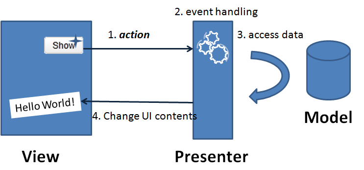
- A user push a button(an action) on the screen. A corresponding event is fired.
- An event listener on the back-end handles this event.
- Access data and so on.
- Then UI elements were changed accordingly to provide visual feedback to the user.
View: helloMVP.gsp<z:window apply="HelloComposer"> <z:label id="lbl"/> <z:button id="btn" label="Show"/> </z:window>
Presenter: HelloComposer.groovyclass HelloComposer{
def lbl def onClick_btn(Event event) {
lbl.setValue("Hello World!")
}
}MVVM Implementation
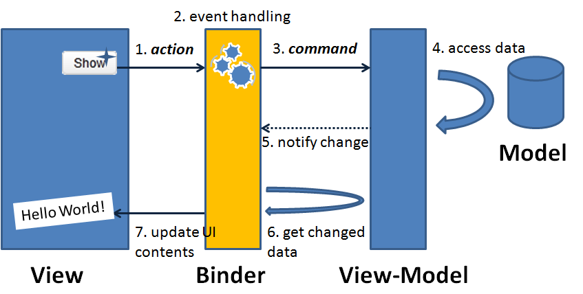 As stated in the paragraph earlier, data binder plays the role of syncing data between UI and ViewModel.
- A user presses a button on the screen.
- A corresponding event is fired to the binder.
- The binder finds the corresponding action logic in the ViewModel and calls it.
- The action logic accesses data from Model layer and updates corresponding properties of the ViewModel.
- ViewModel notify the binder that some properties have been changed.
- Per what properties have been changed, the binder loads data from the ViewModel.
- Binder then updates the corresponding UI controls to provide visual feedback to the user.
- Which UI event is used to proceed which action logic? (so binder knows what method to call).
- Which UI attribute is used to show which data? (so binder knows what to load and what to update).
- Which UI attribute is used to input into which data? (so binder knows what property to save).
View: helloMVVM.gsp
<z:window apply="org.zkoss.bind.BindComposer" viewModel="@id('vm')@init('demo.HelloVM')">
    <z:label value="@bind(vm.message)"/>
    <z:button label="Show" onClick="@command('showHello')"/>
</z:window>
ViewModel: HelloVM.groovy
class HelloVM {
    private String message    public String getMessage() {
        return message
    }    @Command @NotifyChange("message")
    public void showHello() {
        message = "Hello World!"
}}- When end user press the "Show" button, the onClick event is fired to binder.
- The binder finds that the command name in the ViewModel which is "showHello" as specified in the ZK annotation @command('showHello').
- The binder calls the showHello() method in the HelloVM and changes the message property. Note that the @NotifyChange("message") Java method annotation on showHello() method in HelloVM. It tells the binder that the property message in the HelloVM will be changed if this command is called.
- The binder then finds that the attribute value of component label is associated with the changed message property of the HelloVM(as specified in ZK annotation @bind(vm.message)). So it loads data from the property vm.message and updates the label's value attribute. The new message "Hello World!" is then shown on the screen and provides the visual feedback to the end user.
The example revised -- Pop Up the Message
Customers tend to change their minds when they see the real screen. Say, after you demonstrated the program to a customer and he/she said, "Well, I thought the Hello World! message should be in a pop up window...". No problem, let's prepare a modal window and put the message in the modal window. Easy.Revised MVP Implementation
View: helloMVP2.gsp<z:window apply="Hello2Composer"> <z:button id="btn" label="Show"/> <z:window id="popwin" title="Hello" width="300px" height="200px" visible="false"> <z:hbox align="center" pack="center" hflex="true" vflex="true"> <z:label id="lbl"/> </z:hbox> </z:window> </z:window>
class Hello2Composer extends GenericForwardComposer {
    private Label popwin_lbl
    private Window popwin    Hello2Composer() {
        super('_' as char)
    }    public void onClick_btn(Event event) {
        popwin_lbl.setValue("Hello World!")
        popwin.doModal()
    }
}Revised MVVM Implementation
View: helloMVVM2.gsp<z:window apply="org.zkoss.bind.BindComposer" viewModel="@id('vm')@init('demo.HelloVM')"> <z:button label="Show" onClick="@command('showHello')"/> <z:window title="Hello" width="300px" height="200px" mode="modal" visible="@bind(not empty vm.message)"> <z:hbox align="center" pack="center" hflex="true" vflex="true"> <z:label value="@bind(vm.message)"/> </z:hbox> </z:window> </z:window>
See more
Small Talks/2011/November/Hello ZK MVVM9.2 Design your first MVVM page
Case scenario
I will use a search example to show how you can archive MVVM design pattern in Grails ZK UI by using ZK Bind. Please imagine yourself creating a search page in which the searching of an item is done by a filter string; the search result of items is displayed in a list and when selecting on an item, it will also show the details of the selected item.Create Domain class
grails create-domain-class item
Item Domain class:
class Item {
    static transients = ['totalPrice']
    String name
    String description
    double price
    int quantity    Item() {
    }    public Item(String name, String description, double price, int quantity) {
        this.name = name
        this.description = description
        this.price = price
        this.quantity = quantity
    }    public double getTotalPrice() {
        return price * quantity
    }    static constraints = {
    }
}
Create the search service
grails create-service search
class SearchService {    List<Item> search(String fitler) {
        if ("*".equals(fitler)) return Item.list()
        return Item.findAllByNameIlike("%${fitler}%")
    }
}
Design the View Model
Follow the design concept of MVVM, we should design the view model first, we should not consider the visual effect. A view model should not depend on a View, but consider the data and actions as it contract for interacting with the View. In this scenario, we need a String as a filter and a ListModelList<Item> for the search result and a doSearch() method to perform the search command. Further, we also need a selected filed to keep the item which is currently selected. As you can see, I am defending a View Model and it is isolated from the View, which means that it is possible to be reused by another View and even tested by pure Java code. Following is the code of the View Model.grails create-view-model demo.search
class SearchVM {
    //the search condition
   	String filter = "*";
   	//the search result
   	ListModelList<Item> items;   	//the selected item
   	Item selected;   	def searchService
   	public String getFilter() {
   		return filter;
   	}   	@NotifyChange
   	public void setFilter(String filter) {
   		this.filter = filter;
   	}   	public ListModel<Item> getItems() {
   		if(items==null){
   			doSearch();
   		}
   		return items;
   	}    @NotifyChange(["items", "selected"])
    @Command
   	public void doSearch(){
   		items = new ListModelList<Item>();
   		items.addAll(searchService.search(filter));
   		selected = null;
   	}   	public Item getSelected() {
   		return selected;
   	}   	@NotifyChange
   	public void setSelected(Item selected) {
   		this.selected = selected;
   	}
   	Converter totalPriceConverter = null;   	public Converter getTotalPriceConverter(){
   		if(totalPriceConverter!=null){
   			return totalPriceConverter;
   		}
   		return totalPriceConverter = new Converter(){
   			public Object coerceToBean(Object val, Component component,
   					BindContext ctx) {
   				return null;//never called in this example
   			}   			public Object coerceToUi(Object val, Component component,
   					BindContext ctx) {
   				if(val==null) return null;
   				String str = new DecimalFormat('$ ###,###,###,##0.00').format((Double)val);
   				return str;
   			}   		};
}}create-view-model ,we need to notify ZK Bind that the properties of this View Model were changed. In ZK Bind, it has the binder to help the binding between View and View Model. By adding @NotifyChange on a setter method of a property, after binder set the property, it is noticed to reload components that bind to this property. Add @NotifyChange on a command method, after Binder executes the method, it is noticed to reload components that bind to these properties.
For example, I add @NotifyChange on setFilter, when binder sets the value by setFilter(), it is noticed to reload any binding that is related to filter property of the view model. I also added @NotifyChange("items","selected") on doSearch(), that is because when doing the search, I will search by the filter and has a new item list and also reset selected to null, so I need to notify Binder this 2 properties was changed.
With @NotifyChange, it let binder knows when to reload the view automatically.Design a View with ZK Bind
After the View Mode is ready, we are now able to bind View to View Model, not only the data, but also the action, and reloading the changed data automatically (thanks the @NotifyChange in SearchVM). Here is the designed View that will be use in this article to bind with View Model: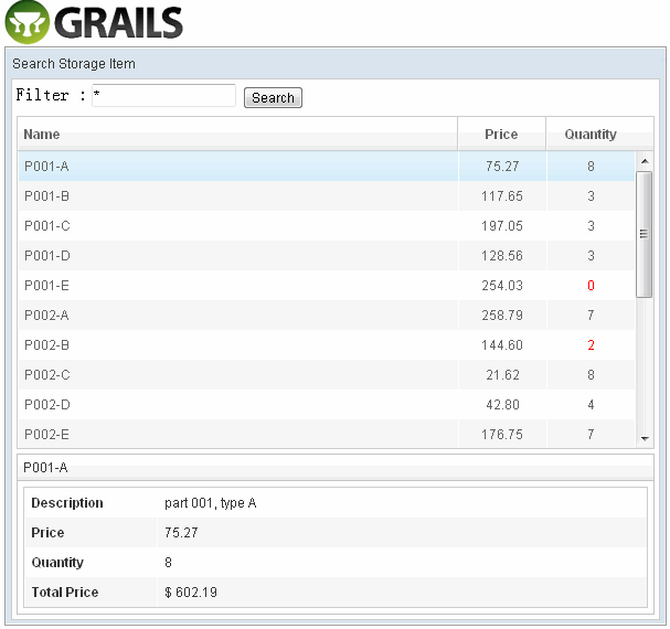
Apply the BindComposer
Now, we have to create a ‘search.gsp’ and bind it to the View Model. To do this, set the ‘apply’ attribute to ‘org.zkoss.bind.BindComposer’ as the composer, and bind the ‘viewModel’ to ‘SearchVM’ that was just created. BindComposer will read all the ZK Bind syntax and create a binder to bind View and View Model.<z:window title="Search Storage Item" border="normal" width="600px" apply="org.zkoss.bind.BindComposer" viewModel="@id('vm')@init('zkui.mvvm.SearchVM')" > ...</z:window>
Binding the textbox with filter data
We need a textbox to represent the filter data, when user types in the textbox, the data will automatically update to ‘vm.filter’, and we also want the search button disabled if the value of ‘vm.filter’ is empty.View : search.gsp<z:textbox value="@bind(vm.filter)" instant="true"/> <z:button label="Search" disabled="@bind(empty vm.filter)"/>
Binding the listbox with search result
In ZK 6, we introduce a new feature called ‘template’, it is a perfect matching when binding a collection. We will have a listbox and a template to show the search result.View : search.gsp<z:listbox model="@bind(vm.items)" selectedItem="@bind(vm.selected)" hflex="true" height="300px"> <z:listhead> <z:listheader label="Name"/> <z:listheader label="Price" align="center" width="80px"/> <z:listheader label="Quantity" align="center" width="80px"/> </z:listhead> <z:template name="model" var="item"> <listitem> <listcell label="@load(item.name)"/> <listcell label="@load(item.price) @converter('formatedNumber', format='###,##0.00')"/> <listcell label="@load(item.quantity)" sclass="@bind(item.quantity lt 3 ?'red':'')"/> </listitem> </z:template> </z:listbox>
Binding the selected item
When binding the listbox, we also bind the selectedItem of the listbox to selected property of the ViewModel. You do not need to worry about selectedItem (in which its value type is a Listitem) of listbox being the incorrect data type for the model because binder will convert it to item automatically. By the binding of selectedItem, when selecting an item in the listbox, the selected property will be updated to the selected item and displayed in detail.View : search.gsp<z:groupbox visible="@load(not empty vm.selected)" hflex="true" mold="3d"> <z:caption label="@load(vm.selected.name)"/> <z:grid hflex="true"> <z:columns> <z:column width="120px"/> <z:column/> </z:columns> <z:rows> <z:row> Description <z:label value="@load(vm.selected.description)"/> </z:row> <z:row> Price <z:label value="@load(vm.selected.price) @converter('formatedNumber', format='###,##0.00')"/> </z:row> <z:row> Quantity <z:label value="@load(vm.selected.quantity)" sclass="@load(vm.selected.quantity lt 3 ?'red':'')"/> </z:row> <z:row> Total Price <z:label value="@load(vm.selected.totalPrice) @converter(vm.totalPriceConverter)"/> </z:row> </z:rows> </z:grid> </z:groupbox>
Converter totalPriceConverter = null public Converter getTotalPriceConverter() {
     if (totalPriceConverter != null) {
         return totalPriceConverter
     }
     return totalPriceConverter = new Converter() {
         public Object coerceToBean(Object val, Component component, BindContext ctx) {
             return null//never called in this example
         }         public Object coerceToUi(Object val, Component component, BindContext ctx) {
             if (val == null) return null
             String str = new DecimalFormat('$ ###,###,###,##0.00').format((Double) val)
             return str
         }
     }
 }
Binding the button action to a command
Now, we have to perform a command of the View Model when clicking on the search button. To do so, add a @command in the onClick event of the button.<z:button label="Search" onClick="@command('doSearch')" disabled="@load(empty vm.filter)"/>
- The evaluation result of the expression result has to be a 'String',
- The string must also be the name of the command
- View model must have an executable method that has the annotation @Command('commandName'), if value of @Command is empty, binder use the method name as command name by default.
The all:search.gsp
<%@ page contentType="text/html;charset=UTF-8" %>
<html>
<head>
    <title>MVVM Demo</title>
    <z:resources/>
    <style type="text/css">
    .z-listcell.red .z-listcell-cnt, .z-label.red {
        color: red;
    }
    </style>
</head>
<body>
<z:window title="Search Storage Item" border="normal" width="600px"
          apply="org.zkoss.bind.BindComposer" viewModel="@id('vm')@init('zkui6demo.SearchVM')">
    <z:vbox hflex="true">
        <z:hbox>
            Filter :
            <z:textbox value="@bind(vm.filter)" instant="true"/>
            <z:button label="Search" onClick="@command('doSearch')" disabled="@load(empty vm.filter)"/>
        </z:hbox>
        <z:listbox model="@load(vm.items)" selectedItem="@bind(vm.selected)" hflex="true" height="300px">
            <z:listhead>
                <z:listheader label="Name"/>
                <z:listheader label="Price" align="center" width="80px"/>
                <z:listheader label="Quantity" align="center" width="80px"/>
            </z:listhead>
            <z:template name="model" var="item">
                <listitem>
                    <listcell label="@load(item.name)"/>
                    <listcell label="@load(item.price) @converter('formatedNumber', format='###,##0.00')"/>
                    <listcell label="@load(item.quantity)" sclass="@bind(item.quantity lt 3 ?'red':'')"/>
                </listitem>
            </z:template>
        </z:listbox>
        <z:groupbox visible="@load(not empty vm.selected)" hflex="true" mold="3d">
            <z:caption label="@load(vm.selected.name)"/>
            <z:grid hflex="true">
                <z:columns>
                    <z:column width="120px"/>
                    <z:column/>
                </z:columns>
                <z:rows>
                    <z:row>Description <z:label value="@load(vm.selected.description)"/></z:row>
                    <z:row>Price <z:label
                            value="@load(vm.selected.price) @converter('formatedNumber', format='###,##0.00')"/></z:row>
                    <z:row>Quantity <z:label value="@load(vm.selected.quantity)"
                                             sclass="@load(vm.selected.quantity lt 3 ?'red':'')"/></z:row>
                    <z:row>Total Price <z:label
                            value="@load(vm.selected.totalPrice) @converter(vm.totalPriceConverter)"/></z:row>
                </z:rows>
            </z:grid>
        </z:groupbox>
    </z:vbox>
</z:window>
</body>
</html>
Initialization data
Initialization data in BootStrap.groovyclass BootStrap { def init = { servletContext ->
List<Item> allItems = new ArrayList<Item>()
allItems.add(new Item("P001-A", "part 001, type A", nextPrice(), nextQuantity()))
allItems.add(new Item("P001-B", "part 001, type B", nextPrice(), nextQuantity()))
allItems.add(new Item("P001-C", "part 001, type C", nextPrice(), nextQuantity()))
allItems.add(new Item("P001-D", "part 001, type D", nextPrice(), nextQuantity()))
allItems.add(new Item("P001-E", "part 001, type E", nextPrice(), nextQuantity())) allItems.add(new Item("P002-A", "part 001, type A", nextPrice(), nextQuantity()))
allItems.add(new Item("P002-B", "part 001, type B", nextPrice(), nextQuantity()))
allItems.add(new Item("P002-C", "part 001, type C", nextPrice(), nextQuantity()))
allItems.add(new Item("P002-D", "part 001, type D", nextPrice(), nextQuantity()))
allItems.add(new Item("P002-E", "part 001, type E", nextPrice(), nextQuantity())) allItems.add(new Item("P003-A", "part 001, type A", nextPrice(), nextQuantity()))
allItems.add(new Item("P003-B", "part 001, type B", nextPrice(), nextQuantity()))
allItems.add(new Item("P003-C", "part 001, type C", nextPrice(), nextQuantity()))
allItems.add(new Item("P003-D", "part 001, type D", nextPrice(), nextQuantity()))
allItems.add(new Item("P003-E", "part 001, type E", nextPrice(), nextQuantity())) allItems.add(new Item("P004-A", "part 001, type A", nextPrice(), nextQuantity()))
allItems.add(new Item("P004-B", "part 001, type B", nextPrice(), nextQuantity()))
allItems.add(new Item("P004-C", "part 001, type C", nextPrice(), nextQuantity()))
allItems.add(new Item("P004-D", "part 001, type D", nextPrice(), nextQuantity()))
allItems.add(new Item("P004-E", "part 001, type E", nextPrice(), nextQuantity()))
allItems*.save()
} Random r = new Random(System.currentTimeMillis()) double nextPrice() {
return r.nextDouble() * 300
} int nextQuantity() {
return r.nextInt(10)
} def destroy = {
}
}