ZK UI plugin,the same as the ZKGrails plugin, seamlessly integrates ZK with Grails' infrastructures.
The difference is it uses the Grails' infrastructures more, such as gsp, controllers rather than zk's zul.
ZK UI Grails plug-ins brings powerful features as follows
Use Tag Libraries
<z:window title="My First ZK UI Application" border="normal">
    Hello World!
</z:window>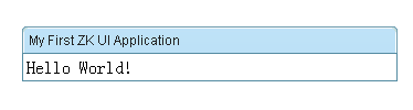
Provides a Composer Artefacts simplify the integration between grails and zk
Usage:
grails create-composer [name]
A groovy way to create zk components, following groovy Builder paradigm
Controller
def index = {
    def window = new Window(title: "listbox demo", border: "normal")
    window << {
        listbox {
            listhead(sizable: true) {
                listheader(label: "name", sort: "auto")
                listheader(label: "gender", sort: "auto")
            }
            listitem {
                listcell(label: "Mary")
                listcell(label: "FEMALE")
            }
            listitem {
                listcell(label: "John")
                listcell(label: "MALE")
            }
            listitem {
                listcell(label: "Jane")
                listcell(label: "FEMALE")
            }
            listitem {
                listcell(label: "Henry")
                listcell(label: "MALE")
            }
            listfoot {
                listfooter {
                    label(value: "This is footer1")
                }
                listfooter {
                    label(value: "This is footer2")
                }
            }
        }
    }
    [window:window]
}
View
<z:render comp="${window}"/>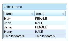
Provides a very convenient API for extracting and manipulating zk component, using the jquery-like methods.
View
<z:window id="window">
    <z:textbox name="t1" value="value1"/>
    <z:textbox id="t2" value="value2"/>
    <z:textbox value="value3"/>
</z:window>
Selector code
assert 3 == window.select("textbox").size()
assert "value2" == window.select("#t2")[0].value
assert "value1" == window.select("textbox[name=t1]")[0].valueDOCTYPE
The html pages generated by gsp must generate the doc type as follows.
<!DOCTYPE html PUBLIC "-//W3C//DTD XHTML 1.0 Transitional//EN"
 "http://www.w3.org/TR/xhtml1/DTD/xhtml1-transitional.dtd">
Importing resources
Add the tag <z:resources/> to the head of the layout/main.gsp or any page that you want to use ZK UI Grails plug-ins.
<html xmlns="http://www.w3.org/1999/xhtml">
  <head>
  <z:resources/>
Hello World!
<!DOCTYPE html PUBLIC "-//W3C//DTD XHTML 1.0 Transitional//EN"
 "http://www.w3.org/TR/xhtml1/DTD/xhtml1-transitional.dtd">
<html xmlns="http://www.w3.org/1999/xhtml">
<head>
    <title>Hello World Demo</title>
    <z:resources/>
</head><body>
<z:window title="My First ZK UI Application" border="normal">
    Hello World!
</z:window>
</body>
</html>Let us put some interactivity into it.
<z:button label="Say Hello" onClick="Messagebox.show('Hello World! Time now is:'+new Date())"/>
Then, when you click the button, you'll see the following:
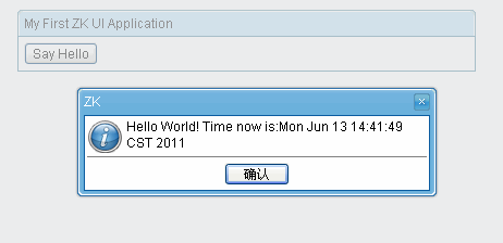
The onClick attribute is a special attribute used to add an event listener to the component such that it is invoked when an end user clicks the component. The attribute value could be any legal groovy code.
Here we invoke
Messagebox.show(String) to show a message box as depicted above.
Notice that it is not JavaScript,It is Groovy and runs at the server
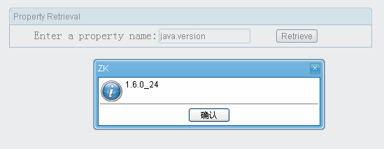
A component is a POJO, so you can reference it any way you like. However, ZK provides a convenient way to identify and to retrieve a component: identifier. For example, we named the textbox as input by assigning id to it, as follows.
<z:window title="Property Retrieval" border="normal">
    Enter a property name: <z:textbox id="input"/>
    <z:button label="Retrieve" onClick="Messagebox.show(System.getProperty(input.getValue()))"/>
</z:window>
A component is a POJO. You could instantiate and manipulate directly. For example, we could generate the result by instantiating a component to represent it, and then append it to another component (an instance of
vlayout).
<z:window title="Property Retrieval" border="normal">
    Enter a property name: <z:textbox id="input"/>
    <z:button label="Retrieve" onClick="result.appendChild(new Label(System.getProperty(input.getValue())))"/>
    <z:vlayout id="result"/>
</z:window>
Similarly you could change the state of a component directly. All modifications will be synchronized back to the client automatically.
<z:window title="Property Retrieval" border="normal">
    Enter a property name: <z:textbox id="input"/>
    <z:button label="Retrieve" onClick="result.setValue(System.getProperty(input.getValue()))"/>
    <z:separator/>
    <z:label id="result"/>
</z:window>Embedding Groovy code in a gsp page is straightforward and easy to read. However, in a production environment, it is usually better to separate the code from the user interfaces. In additions, the compiled Groovy code runs much faster than the embedded code which is interpreted at the run time.
To separate code from UI, we could implement a Composer
use create-composer command
grails create-composer zkuidemo.PropertyRetriever
A composer called PropertyRetrieverComposer will be created in the grails-app/composers directory
Modify the generated PropertyRetrieverComposer as follows
package zkuidemoimport org.zkoss.zk.ui.Component
import org.zkoss.zk.ui.event.Event
import org.zkoss.zul.Labelclass PropertyRetrieverComposer {    def afterCompose = {Component target ->
        target.addEventListener("onClick", new org.zkoss.zk.ui.event.EventListener() { //add a event listener in Groovy
            public void onEvent(Event event) {
                String prop = System.getProperty(target.getFellow("input").getValue())
                target.getFellow("result").appendChild(new Label(prop))
            }
        });
    }
}
The above code can be simplified as follows
package zkuidemoimport org.zkoss.zk.ui.Component
import org.zkoss.zk.ui.event.Event
import org.zkoss.zul.Labelclass PropertyRetrieverComposer {    def afterCompose = {Component target ->
        target.addEventListener("onClick") {Event event ->
            String prop = System.getProperty(target.getFellow("input").value)
            target.getFellow("result").appendChild(new Label(prop))
        }
    }
}
Then, we could associate the Composer (zkuidemo.PropertyRetrieverComposer) with a component by use of the apply attribute as shown below.
<z:window title="Property Retrieval" border="normal">
    Enter a property name: <z:textbox id="input"/>
    <z:button label="Retrieve" apply="zkuidemo.PropertyRetrieverComposer"/>
    <z:separator/>
    <z:vlayout id="result"/>
</z:window>A composer is responsible to initialize a component (or a component of tree) when ZK loader is composing a component. It is the controller in the MVC pattern, while the component is the view,which separate the code from the user interfaces.
Composers can be created with the create-composer target. For example try running the following command from the root of a Grails project:
grails create-composer window
The command will result in the creation of a composer at the location grails-app/composers/WindowComposer.groovy:
class WindowComposer {
    def afterCompose = {Component comp ->
        // initialize components here
    }
}
WindowComposer by default provide a
afterCompose closure to initialize components.
The create-composer command is merely for convenience and you can just as easily create composers using your favorite text editor or IDE
Each component Taglib has a
apply attribute,so you can place the composer here
<z:window id="myWindowComposer" apply="package.WindowComposer">
    …
</z:window>
In the WindowComposer side
def afterCompose = {Component comp ->
    assert comp.id=="myWindowComposer"
    assert (comp instanceof org.zkoss.zul.Window)
}If apply a
composer to a Component that implement a
IdSpace Interface,such as org.zkoss.zul.Window. The Component's children can be auto-wired to composer's fields
The following is an example. The onChange event received by Textbox
mytextbox will be forwarded to target Window
mywin as a new target event onChange_mytextbox and the Textbox component with id name "mytextbox" and Label with id name
mylabel are injected into the "mytextbox" and "mylabel" fields respectively(so you can use mytextbox and mylabel variable directly in onChange_mytextbox without problem).
Composer
class MyComposer{
    Textbox mytextbox
    Window self //embeded object, the supervised window "mywin"
    Page page //the ZK page
    Label mylabel    def afterCompose = {Component comp ->
        assert mytextbox.id=="mytextbox"
        assert mylabel.id=="mylabel"
    }    def onChange_mytextbox(Event event) {
        mylabel.setValue("You just entered: "+ mytextbox.getValue())
    }
}
View
<z:window id="mywin" apply="MyComposer">
    <z:textbox id="mytextbox"/>
    <z:label id="mylabel"/>
</z:window>
Actions can be redirected using the redirect method present in all composers
The parameters of
redirect is same as controller's
redirectComposer
class MyComposer{
    Button mybutton    def afterCompose = {Component comp ->    }    def onClick_mybutton(Event event) {
        redirect(controller: 'demo', action: 'index', id: 1)
    }
}
following code same as onClick_button abovedef afterCompose = {Component comp ->
mybutton.addEventListener('onClick'){
redirect(controller: 'demo', action: 'index', id: 1)
}
}
View
<z:window id="mywin" apply="MyComposer">
    <z:button label="mybutton"/>
</z:window>
To uses Grails' underlying data binding capability,
zkui injection a
getParams method to
Component.
Domain Class
class Person {
    String firstName
    String lastName
    String fullName
    static constraints = {
    }
}
View
<z:window id="mywin" apply="MyComposer">
    <z:textbox name="firstName"/>
    <z:textbox name="lastName"/>
    <z:textbox name="fullName"/>
    <z:button label="submit"/>
</z:window>
Composer
class MyComposer{
    Button submit
    def afterCompose = {Component mywin ->
        submit.addEventListener('onClick'){
            def person=new Person(mywin.params)
            …
        }
    }
}
A
bindData method same as in
controller also provide to Composer
def p = new Person()
bindData(p, mywin.params)
When use
grails create-composer create a composer,a unit class that is a sub-class of ComposerUnitTestCase also created
It provides a
mockComposer methods for mocking zkui's Selector,Builder and so on.
mockComposer(MyComposer)
def myComposer=new MyComposer
...
zkui injection a
renderErrors method to
Component.
If you have Domain class
class Book{
    String author
    String title
}
In View
<z:window id="formWindow" title="demo" apply="your.Composer">
    <z:textbox name="author"/>
    <z:textbox name="title"/>
    …
</z:window>
Then in
your.Composer use renderErrors
if (!book.save()) {
            formWindow.renderErrors(bean: book)
 }
In addition,you can also use grails's traditional
renderErrorsIn
your.Composer
if (!book.save()) {
    flash.book = book
    redirect(controller: "book", action: "edit", id: book.id)
 }
In your view
<g:hasErrors bean="${flash.book}">
<div class="errors">
    <g:renderErrors bean="${flash.book}" as="list" />
</div>
</g:hasErrors>Data binding is a mechanism that automates the data-copy plumbing code (CRUD) between UI components and the data source. Application developers only have to tell the data binding manager about the associations between UI components and the data source. Then, the data -binding manager will do all the loading (loading data from the data source to UI components) and saving (saving data from UI component into the data source) jobs automatically.
Activates Data Binding Manager
<z:window  apply="org.zkoss.demo.MyComposer,org.zkoss.zkplus.databind.AnnotateDataBindingComposer">
</z:window>
For more information, please refer to the relative blog post
Databinding ComposerAssociate UI Components with Data Source
After activating the data-binding manager, you have to define the required UI objects and then associate them with the data source.
In the gsp view:
<z:window id="win" apply="test.TestComposer,org.zkoss.zkplus.databind.AnnotateDataBindingComposer">
    <z:textbox value="@{win#composer.username}"/>
<z:/window>
In the test.TestComposer:
class TestComposer{    def username="test"    def afterCompose = {Component comp ->
        …
    }
}
See more
ZK Developer's Reference/Data Binding
Builders are internal DSLs that provide ease in working with certain types of problems.It is very useful for work with nested,hierarchical structures, such as tree structures, XML representations,or HTML representations.
Let’s take a look at an example of one way to create zk component in Groovy—using a builder:
appendChild is dynamic method that
ZKUI injection to zk
Component to begin builder,which accepts a Closure parameter.
def window = new Window(title: "listbox demo", border: "normal")
window.appendChild {
    listbox {
        listhead(sizable: true) {
            listheader(label: "name", sort: "auto")
            listheader(label: "gender", sort: "auto")
        }
        listitem {
            listcell(label: "Mary")
            listcell(label: "FEMALE")
        }
        listitem {
            listcell(label: "John")
            listcell(label: "MALE")
        }
        listitem {
            listcell(label: "Jane")
            listcell(label: "FEMALE")
        }
        listitem {
            listcell(label: "Henry")
            listcell(label: "MALE")
        }
        listfoot {
            listfooter {
                label(value: "This is footer1")
            }
            listfooter {
                label(value: "This is footer2")
            }
        }
    }
} also provides a convenient method
leftShift( << ),so you can modify the above code like:
def window = new Window(title: "listbox demo", border: "normal")
window << {
    listbox {
       …
    }
}If the parameter on onEvent it's a Closure, then it's a server side event
window << {
    button(label: 'button', onClick: {
        Messagebox.show("hello word! from Server")
    })
}If the parameter on onEvent it's a String, that is a client side event
window << {
    button(label: 'buutton', onClick: "alert('Say hello word! from JS')")
}
Add a prefix
client_ is useful when you also use server side event that avoid naming conflicts
window << {
    button(label: 'buutton', client_onClick: "alert('Say hello word! from JS')",onClick:{
        Messagebox.show("hello word! from Server")
    })
}ZK UI Plugin support a CSS (or jquery) like selector syntax to find matching components, that allows very powerful and robust queries.
It's inspired by the
jsoupThe
select method is injected to
Component,which returns a list of Component.
View code
<z:window id="window" apply="MyComposer">
    <z:textbox name="t1" value="value1"/>
    <z:textbox id="t2" value="value2"/>
    <z:textbox value="value3"/>
</z:window>
Composer code
class MyComposer{    def afterCompose = {Component window ->
        assert 3 == window.select("textbox").size() // select method returns List<Component>
        assert "value2" == window.select("#t2")[0].value
        assert "value1" == window.select("textbox[name=t1]")[0].value
    }}
- tagname: find components by tag, e.g.
textbox
- #id: find components by ID, e.g.
#compId
- .class: find components by class name, e.g.
.masthead
- [attribute]: components with attribute, e.g.
[href]
- [^attr]: components with an attribute name prefix, e.g.
[^lab]
- [attr=value]: components with attribute value, e.g.
[width=500]
- [attr^=value], [attr$=value], [attr*=value]: components with attributes that start with, end with, or contain the value, e.g.
[href*=/path/]
- [attr~=regex]: components with attribute values that match the regular expression; e.g.
img[src~=(?i).(png|jpe?g)]
- *: all components, e.g.
*
- el#id: components with ID, e.g.
textbox#compId
- el.class: components with class, e.g.
textbox.masthead
- el[attr]: components with attribute, e.g.
a[href]
- Any combination, e.g.
a[href].highlight
- ancestor child: child components that descend from ancestor, e.g.
.body textbox finds textbox components anywhere under a block with class "body"
- parent > child: child components that descend directly from parent, e.g.
window.content > textbox finds textbox components; and window > * finds the direct children of the window tag
- siblingA + siblingB: finds sibling B element immediately preceded by sibling A, e.g.
- siblingA ~ siblingX: finds sibling X element preceded by sibling A, e.g.
intbox ~ textbox
- el, el, el: group multiple selectors, find unique components that match any of the selectors; e.g.
div.masthead, div.logo
- :lt(n): find components whose sibling index (i.e. its position in the component tree relative to its parent) is less than n; e.g.
listitem:lt(3)
- :gt(n): find components whose sibling index is greater than n; e.g.
div label:gt(2)
- :eq(n): find components whose sibling index is equal to n; e.g.
window textbox:eq(1)
- :has(seletor): find components that contain components matching the selector; e.g.
div:has(label)
- :not(selector): find components that do not match the selector; e.g.
div:not(.logo)
Declare an Event Handler in gsp
An event handler can be declared in a gsp page by specifying an event attribute(An event attribute is an attribute starting with on). For example,
<z:button label="hi" onClick='alert("Hello")'/>
where the content of the event handler is the code snippet in Groovy. The event handler will be interpreted at the run time.
Important Builtin Variables
- self - the component receiving the event. In the previous example, it is the button itself.
- event - the event being received. In the previous example, it is an instance of MouseEvent.
Listen by Use of an Event Listener
An event listener is a class implementing EventListener. For example,
class MyListener implements EventListener {
    void onEvent(Event event) {
        Messages.show("Hello")
    }
}
Then, you can register an event listener to the component that might receive the event by use of Component.addEventListener(String, EventListener). For example,
button.addEventListener("onClick", new MyListener())This is a typical approach to handle events. However, it is a bit tedious to register event listeners one-by-one if there are a lot of listeners.
Rather, it is suggested to use the following method:
button.addEventListener("onClick"){Event event->
    Messages.show("Hello")
}
Composer and Event Listener Autowiring
With
Auto-wired Component, you generally don't need to register event listeners manually. Rather, they could be registered automatically by use of the auto-wiring feature of a composer. For example
class MyComposer{
    void onClick_hi() {
        Messsagebox.show("Hello")
    }
    void onClick_bye() {
        Messsagebox.show("Bye")
    }
}
As shown above, the method to listen an event shall be named by starting with the event name, separating with
_, and ending with the component's ID. The composer will search all matched methods and register the event listener automatically. Then, in the gsp page, you can specify the apply attribute to associate the composer with a component.
<z:window apply="MyComposer">
    <z:textbox/>
    <z:button id="hi"/>
    <z:button id="bye"/>
</z:window>
If the listener needs to access the event, just declare it as the argument:
void onClick_hi(MouseEvent event) {
  Messsagebox.show("Hello, " + event.getName())
}
Though not limited, a composer is usually associated with an ID space (such as Window) to handle events and component within the give ID space. You could associate any component that properly represents a scope of your application to manage.
See more
Auto-wired ComponentDeclare a Event Handler in zkui's Builder
see
Event listeningZK allows applications to handle events at both the server and client side. Handling events at the server side, as described in the previous sections, are more common, since the listeners can access the backend services directly. However, handling event at the client side improves the responsiveness. For example, it is better to be done with a client-side listener if you want to open the drop-down list when a comobox gains focus.
A good rule of thumb is to use server-side listeners first since it is easier, and then improve the responsiveness of the critical part, if any, with the client-side listener.
Declare a Client-side Listener in gsp
Declaring a client-side listener in a gsp is similar to declaring a server-side listener, except
- Use the client_ Prefix
- It is JavaScript
- Use this to reference to the target widget (while the event is referenced with event)
- Use this.$f() to reference fellow widgets (Widget.$f())
For example,
<z:combobox client_onFocus="this.open()"/>
The Relationship between Client and Server-side Event Listener
It is allowed to register both the client and server-side event listeners. They will be both invoked. Of course, the client-side listener is called first, and then the server-side listener. For example,
<z:div>
  <z:combobox client_onFocus="this.open()" onFocus="self.parent.appendChild(new Label('focus'))"/>
</z:div>
If you want to stop the event propagation such that the server won't receive the event, you could invoke Event.stop(Map). For example, the server-side listener won't be invoked in the following example:
<z:div>
  <z:combobox client_onFocus="this.open(); event.stop();" onFocus="self.parent.appendChild(new Label('focus'))"/>
</z:div>
Declare a Client-side Listener in Groovy
The other way to declare a client-side listener at the server is Component.setWidgetListener(String, String). For example,
combobox.setWidgetListener("onFocus", "this.open()")
Notice that it is Groovy and running at the server.
Register a Client-side Listener in Client-Side JavaScript
Listening an event at the client could be done by calling Widget.listen(Map, int). For example,
<z:window>
    <z:bandbox id="bb"/>
    <z:script defer="true">
        this.$f().bb.listen({onFocus: function () {this.open();}});
    </z:script>
</z:window>
where
- defer="true" is required such that the JavaScript code will be evaluated after all widgets are created successfully. Otherwise, it is not able to retreive the bandbox (bb).
- script is a widget (unlike zscript), so this references to the script widget, rather than the parent.
- Widget.$f(String) is equivalent to Component.getFellow(String), except it is a JavaScript method (accessible at the client).
Declare a Client-side Listener in zkui's Builder
see
Client-side event listeningZkui supports a feature known as scaffolding which involves the generation of a CRUD (Create/Read/Update/Delete) interface for a given domain class
Same as Grails's generate-all command,
zkui use
zkui-generate-all to generates views,composer and a controller for the given domain class
To zkui's scaffolding work,you need modify the default layout/main.gsp
- Add the tag <z:resources/> to the head
- Remove <link rel="stylesheet" href="${resource(dir:'css',file:'main.css')}" />
- Generate the doc type as follows
<!DOCTYPE html PUBLIC "-//W3C//DTD XHTML 1.0 Transitional//EN"
 "http://www.w3.org/TR/xhtml1/DTD/xhtml1-transitional.dtd">
<!DOCTYPE html PUBLIC "-//W3C//DTD XHTML 1.0 Transitional//EN"
 "http://www.w3.org/TR/xhtml1/DTD/xhtml1-transitional.dtd">
<html xmlns="http://www.w3.org/1999/xhtml">
<head>
    <title><g:layoutTitle default="Grails"/></title>
    <z:resources/>
    <g:layoutHead/>
</head>
<body>
<div id="grailsLogo"><a href="http://grails.org"><img src="${resource(dir: 'images', file: 'grails_logo.png')}"
                                                      alt="Grails" border="0"/></a></div>
<g:layoutBody/>
</body>
</html>
The templates used by zkui to generate the controller, views and composer can be customized by installing the templates with the
zkui-install-templates command.
ZK UI supports ZK Enterprise features.
Just put the zk ee jar to
libs or put jar dependencies in grails-app/conf/BuildConfig.groovy
You can also install the Enterprise edition by
$ grails install-plugin zk-ee
This plugin contains addition jars required for enabling ZK Enterprise features.
How to use
You can simply put theme jar in
lib directory.
Or add dependencies in grails-app/conf/BuildConfig.groovy
First, add zkoss' maven Dependency Repositories
repositories {
        …
        mavenRepo "http://mavensync.zkoss.org/maven2/"
        …
}
Second,specify dependencies
dependencies {
        // there are three theme 'breeze', 'sapphire', 'silvertail'
        def zkThemeVersion="5.0.9"
        def zkTheme="breeze"
        runtime "org.zkoss.theme:${zkTheme}:${zkThemeVersion}"
    }
How to switch different themes dynamically
The default theme provider checks the current theme settings in order of preferences;
First priority: Cookie
Set cookie zktheme=name
For instance, write cookie zktheme=breeze, breeze theme will be activated
Second priority: Library property
The default theme provider will obtain the current theme setting from library property if cookie is empty.
<library-property>
     <name>org.zkoss.theme.preferred</name>
     <value>name</value>
</library-property>
For example, the following code will activiate the breeze theme.
<library-property>
     <name>org.zkoss.theme.preferred</name>
     <value>breeze</value>
</library-property>
Third priority: System's default them
The default theme provider maintains a default theme. If theme provider can't find theme setting in cookie or library property, default theme will be activated.
Dynamically switch themes using cookie
Here are a list of cookie sample codes that you can choose from.
Breeze
Themes.setTheme(Executions.getCurrent(), "breeze")
Executions.sendRedirect(null)
Sapphire
Themes.setTheme(Executions.getCurrent(), "sapphire")
Executions.sendRedirect(null)
Silvertail
Themes.setTheme(Executions.getCurrent(), "silvertail")
Executions.sendRedirect(null)
Classic blue
Themes.setTheme(Executions.getCurrent(), "classicblue")
Executions.sendRedirect(null)
Dynamically switch themes using library property
Breeze
Library.setProperty("org.zkoss.theme.preferred", "breeze")
Executions.sendRedirect(null)
Sapphire
Library.setProperty("org.zkoss.theme.preferred", "sapphire")
Executions.sendRedirect(null)
Silvertail
Library.setProperty("org.zkoss.theme.preferred", "silvertail")
Executions.sendRedirect(null)
Classic blue
Library.setProperty("org.zkoss.theme.preferred", "classicblue")
Executions.sendRedirect(null)
Retrieve web app supported theme names
String names = Library.getProperty("org.zkoss.theme.names");Reference
ZK Themes GetStartedYou can extends the org.grails.plugins.zkui.AbstractTagLib implement the Extensions Component's Taglib same as:
import org.grails.plugins.zkui.AbstractTagLibclass CalendarsTagLib extends AbstractTagLib {
    static namespace = "z"    def calendars = { attrs, body ->
        doTag(attrs, body, "calendars")
    }}
and put the Calendar jar to
lib